A modern chat platform built with next-gen MLS encryption to ensure secure, seamless conversations
UX Design
Design System
UI Design
Micro-Interactions
Design Dev Handoff
Shaping the Future of Messaging with MLS-Encrypted Chats
Kchat is a security-focused chat platform designed to empower individuals and organizations to communicate confidently and securely. Tailored for markets across Asia, Kchat combines end-to-end encryption, cross-device flexibility, and seamless user experience to make private conversations intuitive and accessible.
As a senior product designer working under a lead product designer, I led and mentored two other product designers, steering the comprehensive UX and UI design process — from in-depth competitor benchmarking and research to feature prioritization, security logic design and design system development.
| Role: Product Designer
| Timeline: 12 months
| Platform: Mobile (iOS & Android), Responsive Web
| Tools: Figma, FigJam, Lottie Files & After Effect (Micro-Interactions), JIRA and Confluence
| Team: 4 PM, 8 Frontend Developers, 2 QA, 1 Lead Product Designer, 1 Senior Product Designer (Me), 2 Product Designers
Design Goals & Challenges

Problems Identified
While defining our design goals, we realized Kchat wasn’t just another messaging app — it had to balance robust security with an effortless, almost invisible user experience.
But reality wasn’t so simple. Here’s what surfaced:
Employees lacked clarity on how to move forward within the company
They expected seamless syncing across devices, no hiccups.
Wanted to feel safe, but still customize and express themselves.
Craved rich features (channels, mentions, replies) but hated heavy apps.
Expected privacy that felt familiar, not intimidating.
"
Users value privacy and security, but not at the expense of simplicity
~ What we learned while shaping Kchat
Research & Insights
A) Competitor's Study
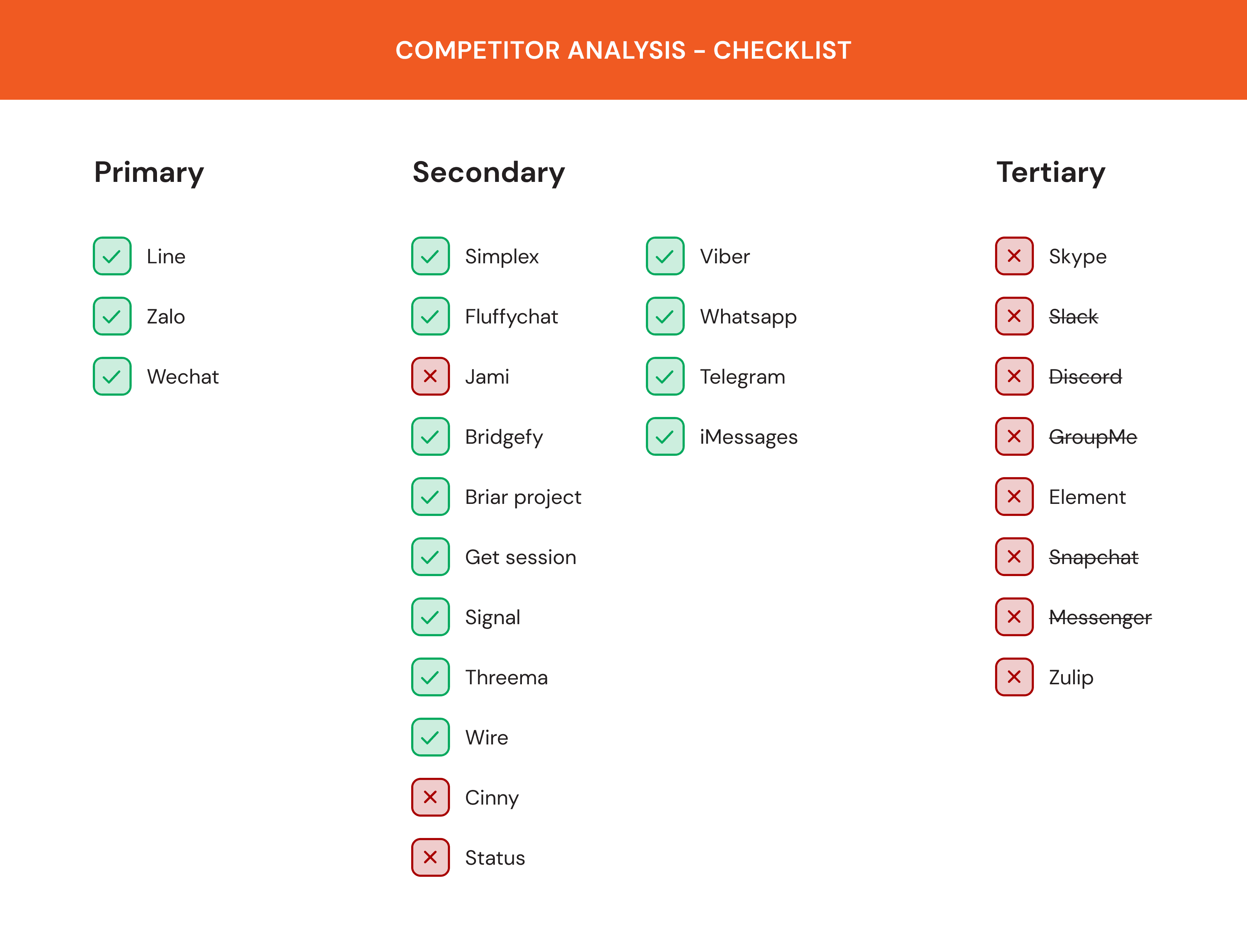


Key Findings
Privacy and control were front and center — users want total security without compromising ease of use
Strong demand for seamless multi-device experiences, letting people switch between mobile and desktop effortlessly
Users crave smart features like AI-powered summaries and voice-to-text to keep chats fast and frictionless
Super-app integrations (e.g., payments, shopping, ride-hailing) are raising expectations for added convenience
Heavy emphasis on visual expression: stickers, themes, and customization are now non-negotiable
Growing interest in ephemeral content (disappearing messages, stealth exits) for enhanced privacy and reduced social pressure
B) Empathy Mapping From Real Voices
To truly understand local communication habits and cultural nuances, we created detailed empathy maps focused on Zalo — Vietnam’s most widely used messaging app. We synthesized insights from in-depth interviews with everyday users and extensive reviews on the App Store and Google Play.

Here's what stood out:
People loved feeling connected, but felt frustrated by missing files and poor device syncing
Privacy worries were common; users didn’t fully trust where their data went
File sharing and storage were big priorities — users expected this to just work
Many wanted security, but without extra steps or confusing settings
C) Survey Insights
To validate our early research and prioritize features, we rolled out a survey to understand real user needs, preferences, and frustrations. We focused primarily on Vietnamese respondents, gathering insights from both everyday users and workplace communication habits.
We received over 170 responses, with the majority aged 22–50 and primarily male. While most users mentioned Telegram and Facebook Messenger as their preferred apps, privacy and simplicity emerged as shared priorities across the board.
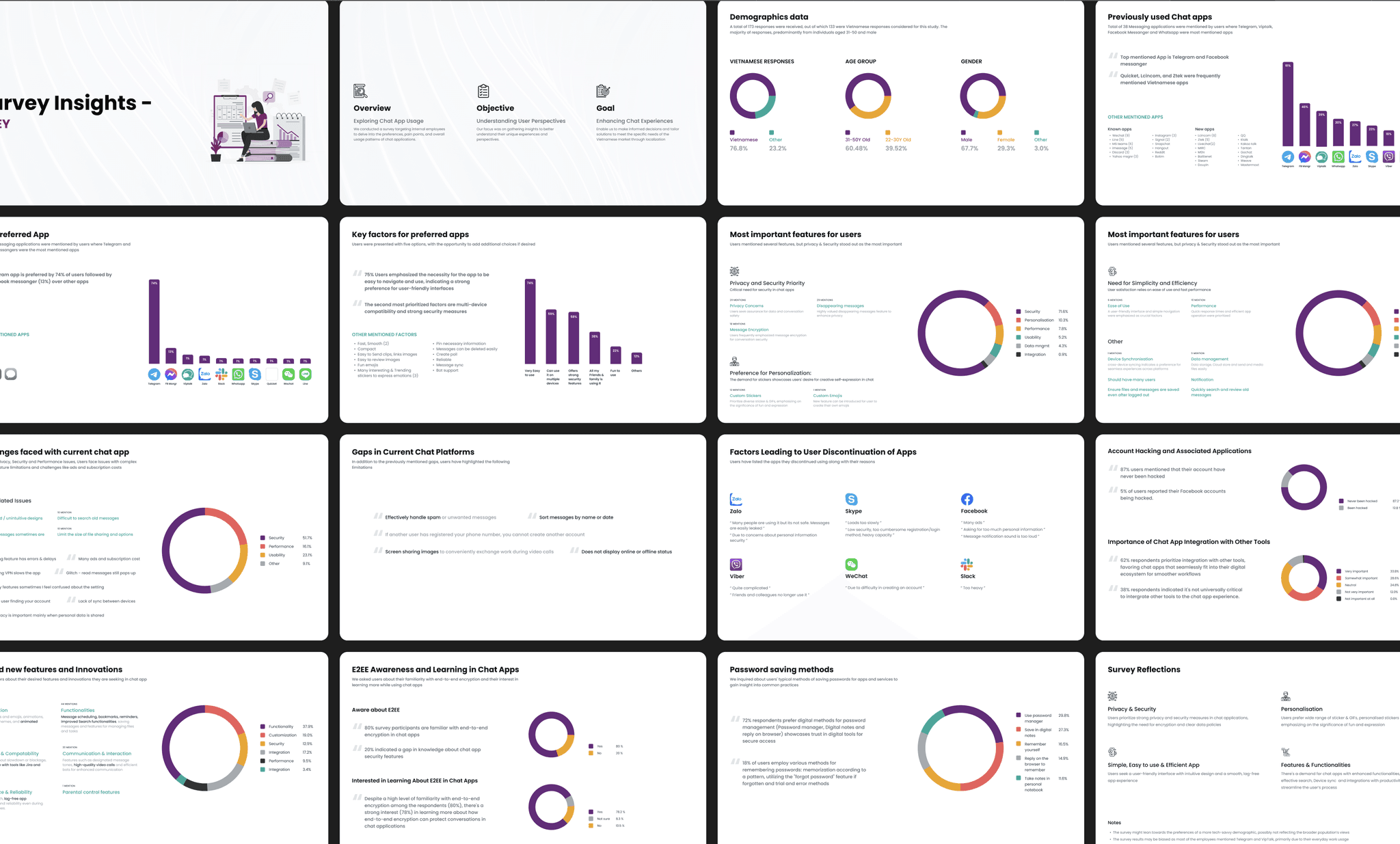
Key findings:
Privacy & security were top priorities, but users rejected complicated flows
Smooth multi-device support and fast syncing were critical expectations
High interest in personalization: stickers, themes, and expressive tools
Desire for advanced functionalities: message scheduling, improved search, and file management
Simplicity and reliability were deal-breakers; users wouldn’t trade them for extra features
While many were familiar with encryption, most still wanted clear, easy-to-understand privacy education
D) Persona Mapping
Building on our empathy mapping and survey insights, we defined two core personas to guide Kchat’s design direction. These personas helped us focus on balancing privacy needs with simple, intuitive flows — ensuring that both security-focused professionals and everyday social users felt equally at home.


E) Feature Set Prioritisation
After synthesizing all research insights, we translated user needs and security priorities into a clear, phased roadmap. Features were carefully divided into multiple phases to ensure a strong, trustworthy core experience first, followed by advanced layers that could be introduced progressively.

UX Structure & Flows
A) Information Architecture
We created a detailed information architecture to define how all core and future features connect across Kchat. This helped us ensure every function — from core messaging to advanced privacy settings — had a clear place in the overall structure.
By mapping even the features planned for later phases early on, we maintained a strong foundation, avoided future design silos, and made sure user flows would stay seamless as the product evolved.

B) Lean UX Canvas
As part of our approach, we used a Lean UX Canvas for each major module to quickly align business needs, user problems, and potential solutions. This method allowed us to validate risky assumptions early, focus on real user outcomes, and shape key features without overinvesting upfront.

C) User Flows & User Journeys
Once the architecture and Lean UX Canvas were set, we zoomed in to map every click and feeling.
✧ User flows show the exact steps users take to get things done — like a detailed map
✧ User journeys capture the bigger story — what they think, feel, and experience along the way
We created these for every subcategory under each module, so nothing felt clunky or confusing. The goal? Make every task feel smooth, and every moment feel right.


D) Early UX Concepts (Low-Fidelity Screens)
We created low-fidelity screens for each main flow to align the team and developers on the core direction before diving into details. These early concepts focused on happy paths only — without edge cases or error states — to keep the vision clear and fast to iterate.
Once these foundations were approved, we moved into high-fidelity designs with full interactions and refinements.

UI Foundation
A) Material & Apple's HIG Design Systems
Kchat, we adopted native design systems to align with platform-specific user expectations and accelerate development. We used Material Design for Android and desktop, and Apple’s Human Interface Guidelines for iOS.
Choosing these native foundations made engineering smoother and ensured the app felt natural to each user base. We then customized and extended these systems to reflect Kchat’s unique brand personality and visual identity — balancing familiarity with our own refined touch.


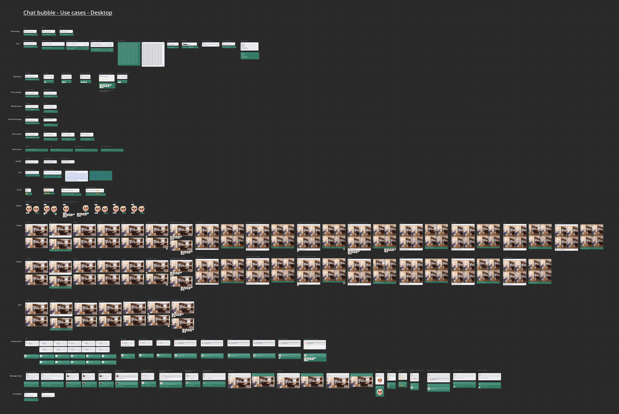
B) Unique Chat Components
One of the most critical and complex elements in Kchat was the chat bubble system. I designed over 40 detailed variants to cover every possible scenario — including messages with media, replies, mentions, reactions, system prompts, blocked user states, and more.
These variants ensured every edge case felt polished and consistent, while supporting advanced features like MLS encryption statuses and preview metadata.
To make development seamless, I created a 120-page handoff document breaking down each bubble variant with precise behaviors, states, and visual guidelines. This level of detail allowed the dev team to implement the system confidently and maintain pixel-perfect accuracy across platforms.


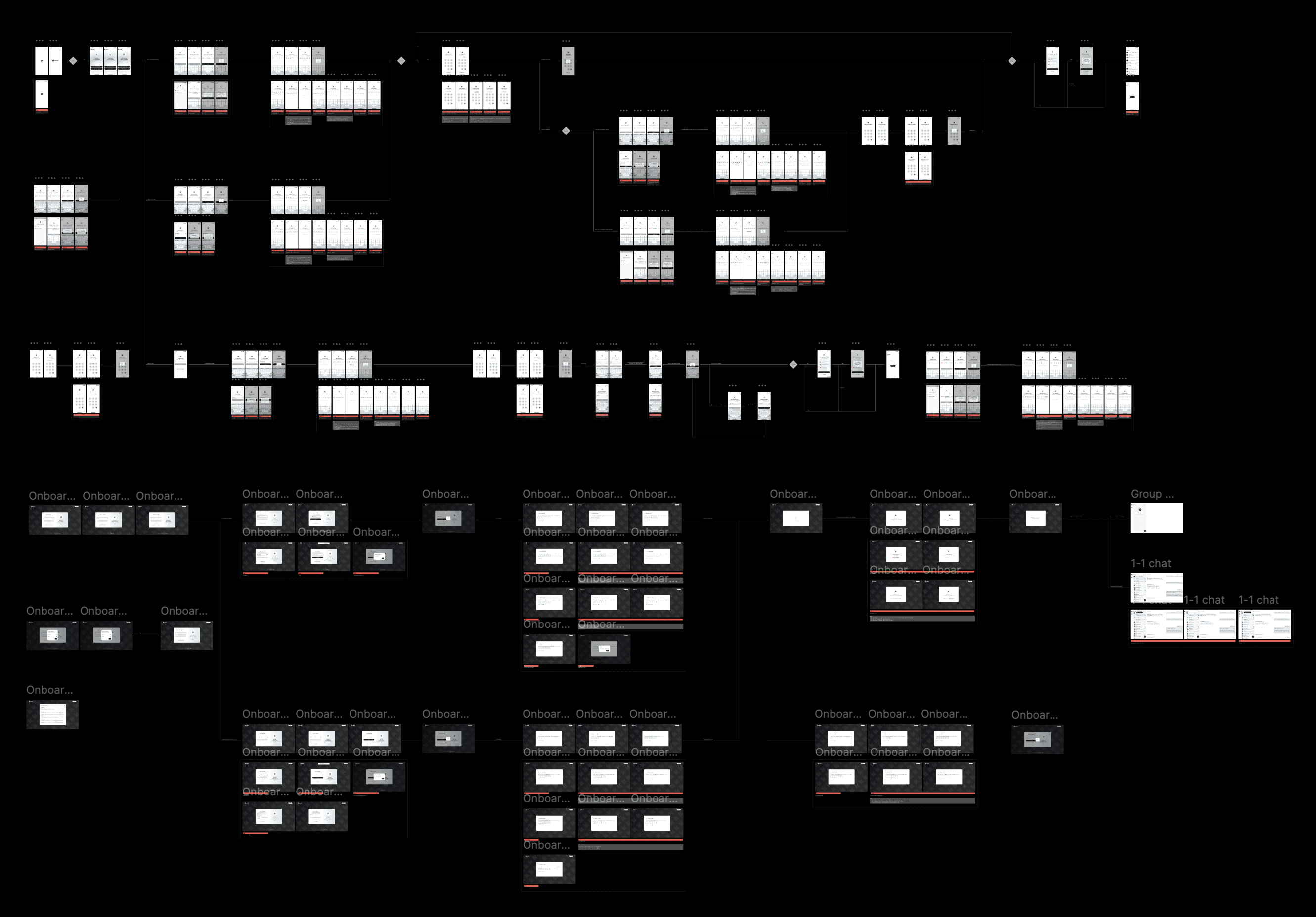
Final Designs
The final design phase for Kchat covered three distinct interfaces — iOS, Android, and Desktop — each tailored using their respective native design systems (Material and Apple). This approach ensured an intuitive, familiar experience for every user segment while optimizing developer efficiency.
Every design was delivered as fully mapped responsive screens and interactive flows, capturing all touchpoints clearly for developers and QA teams. We also meticulously included edge cases and error states across screens, making the handoff seamless and self-explanatory.
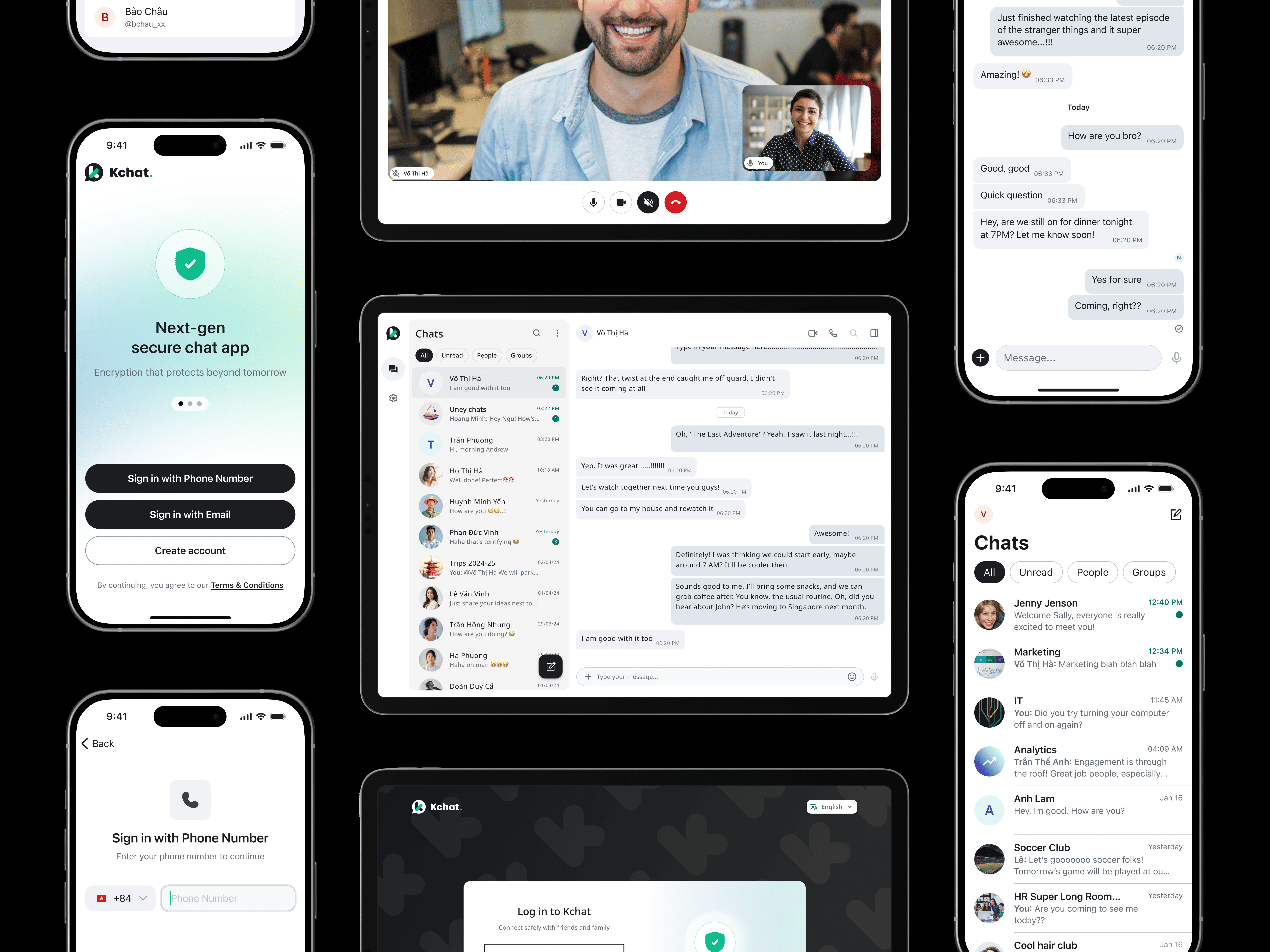
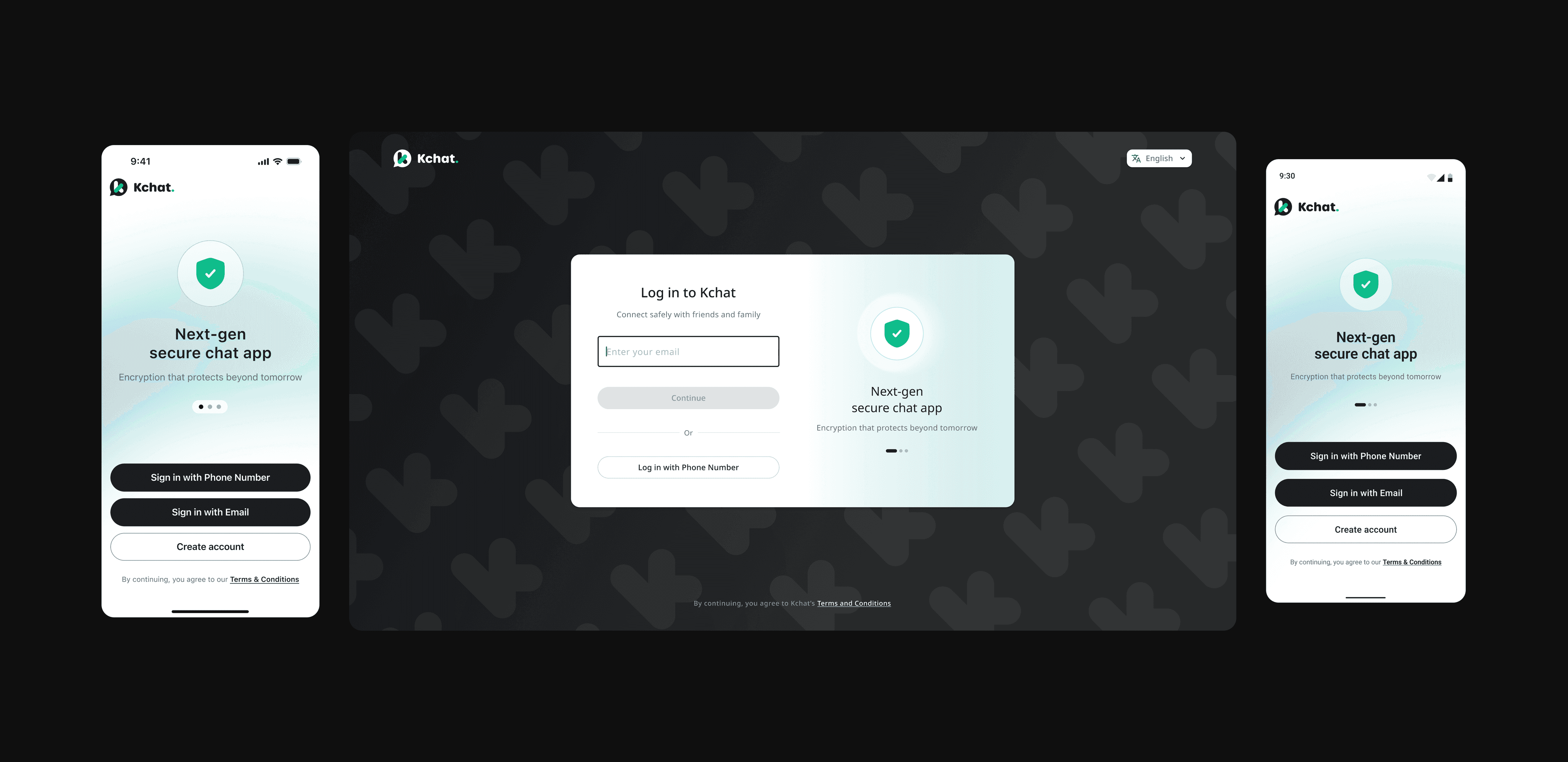
1/5 - Onboarding Flow
A comprehensive login/signup flows covering all screens from app launch to home. It includes number verification, OTP handling, permissions, security setup, and auto-login logic, ensuring new users are guided confidently while minimizing friction.


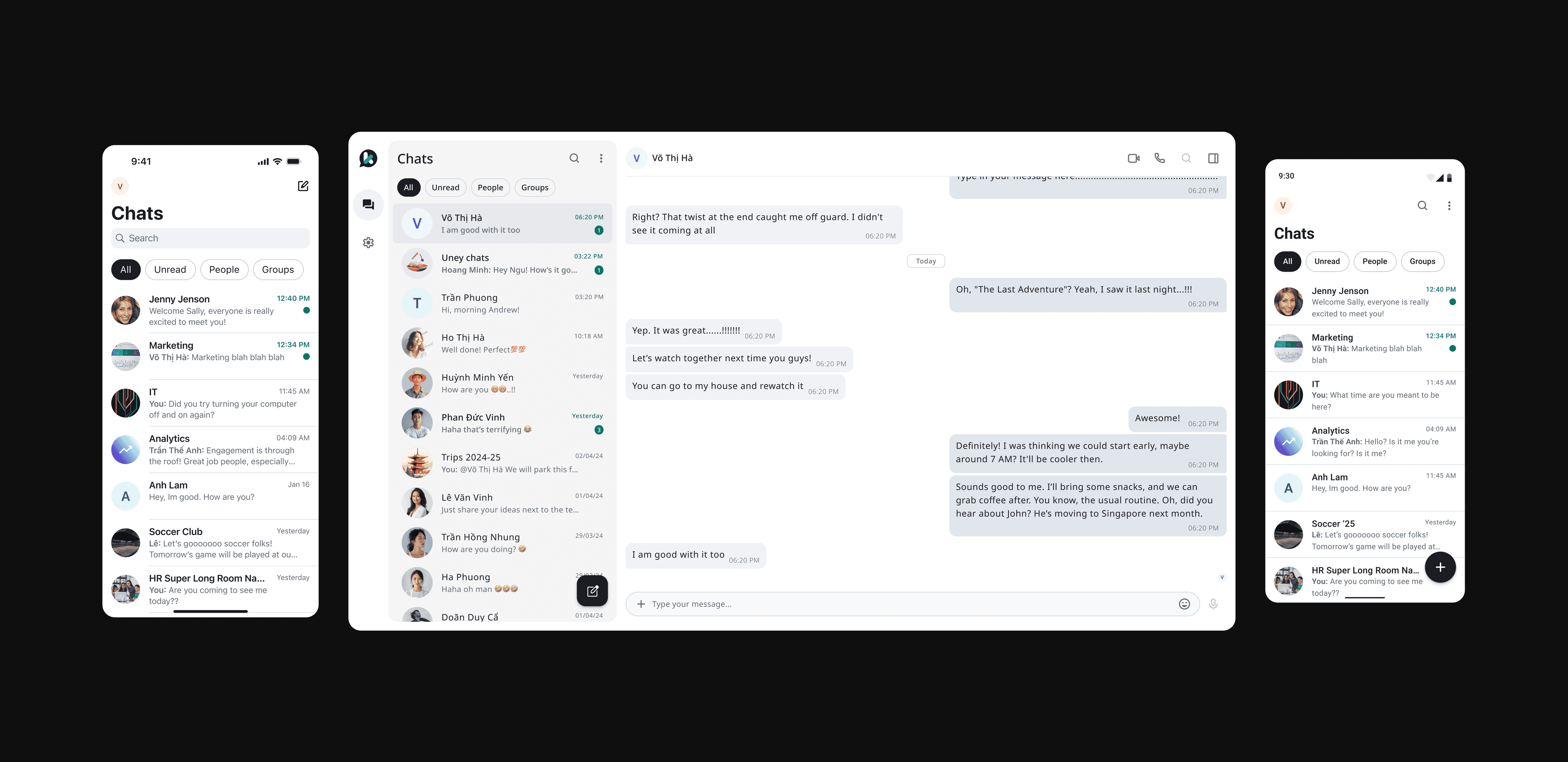
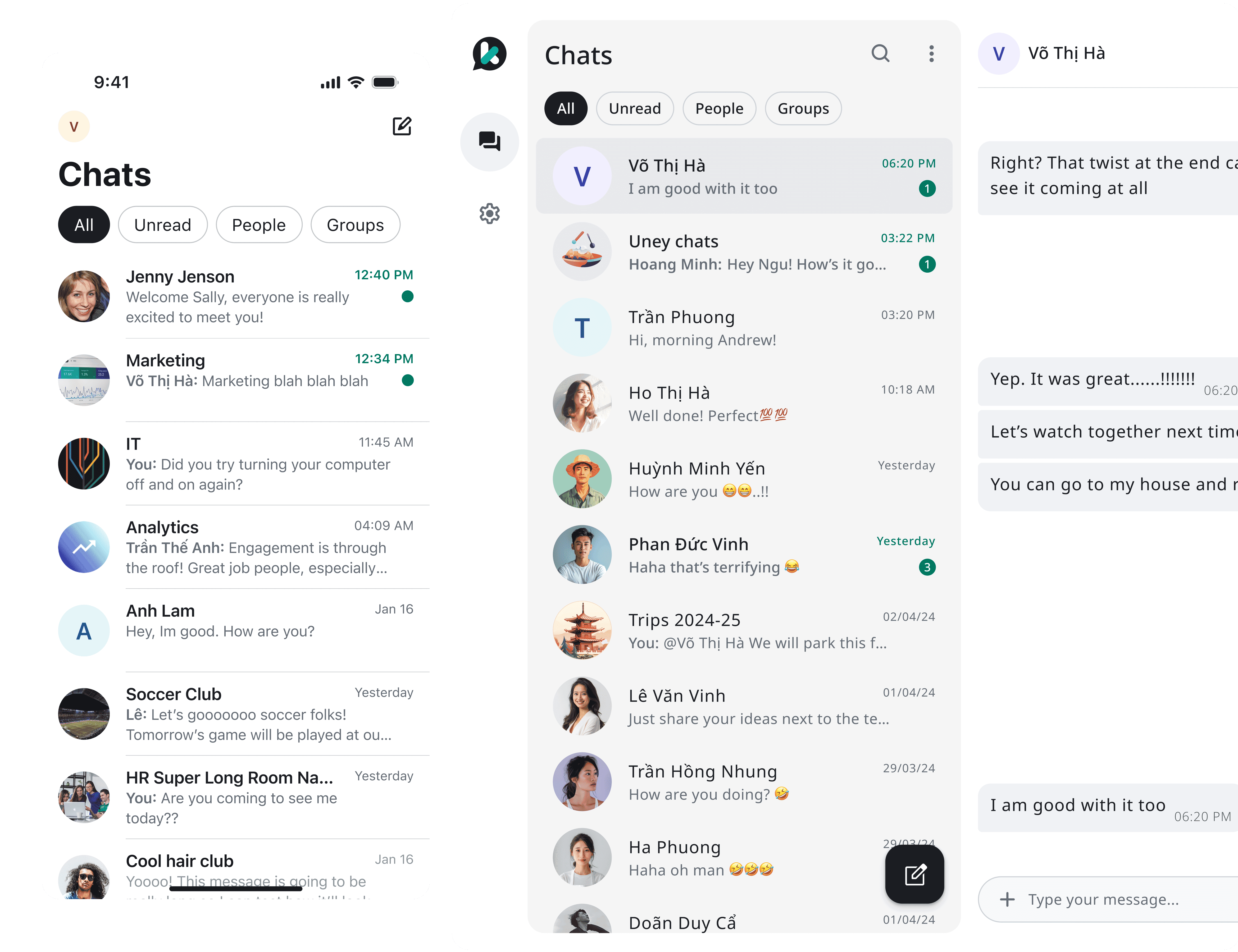
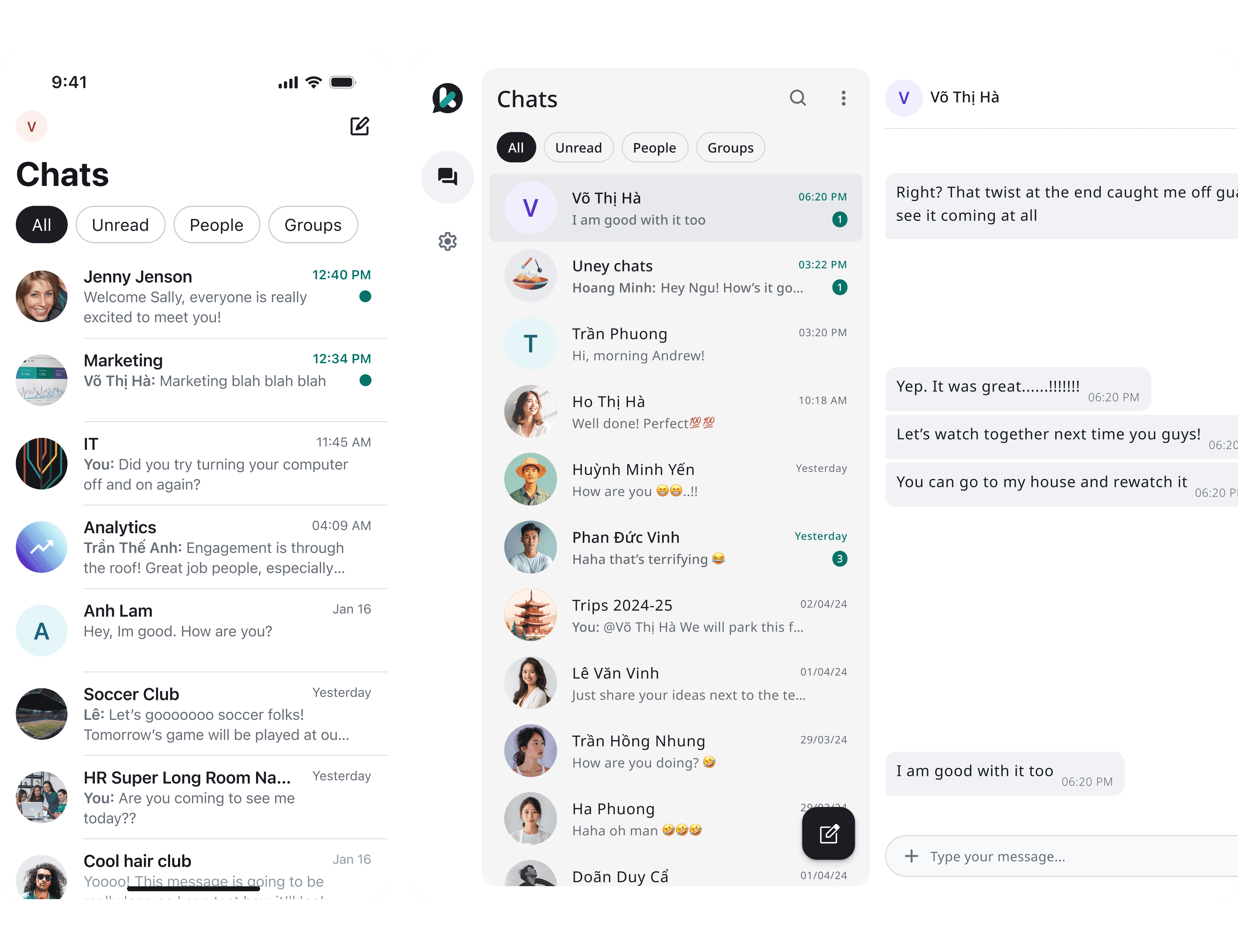
2/5 - Homepage & Related Touchpoints
All possible homepage scenarios were detailed here — chat list states, unread indicators, pinned conversations, archived chats, and system banners. Designed to provide users instant clarity and quick access to their conversations.

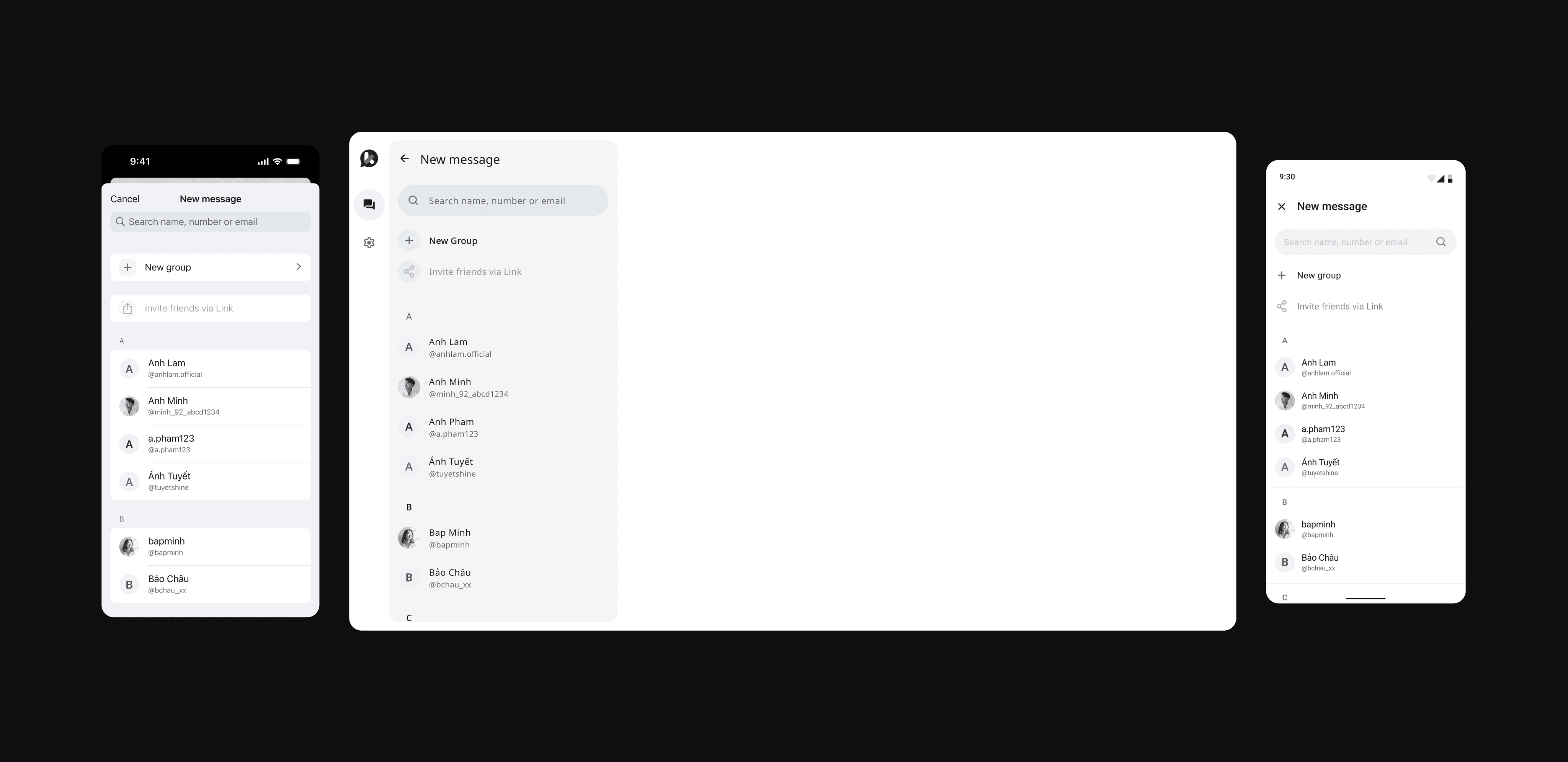
3/5 - Direct 1-1 Messaging
Covers the complete 1-1 messaging experience: starting a chat, text and media messaging, reactions, replies, calls, contact actions, and profile views. Each state and action was carefully designed for security-focused yet smooth personal communication.


4/5 - Group Messaging
Dedicated to collaborative messaging. Includes group creation, participant management, group profile settings, mentions, group calls, media sharing, and admin-specific controls. Designed to support active group dynamics without compromising usability.


5/5 - Profile & Settings
Consolidates all personal settings: account details, privacy and security configurations, linked devices, customization options, and help center access. Structured to give users direct control without overwhelming nested menus.

Impacts & Takeaways
Explore Other Works


More about me