A two-mode VPN that balances high-speed DNS and military-grade security based on your need.
UX Design
Design System
UI Design
Micro-Interactions
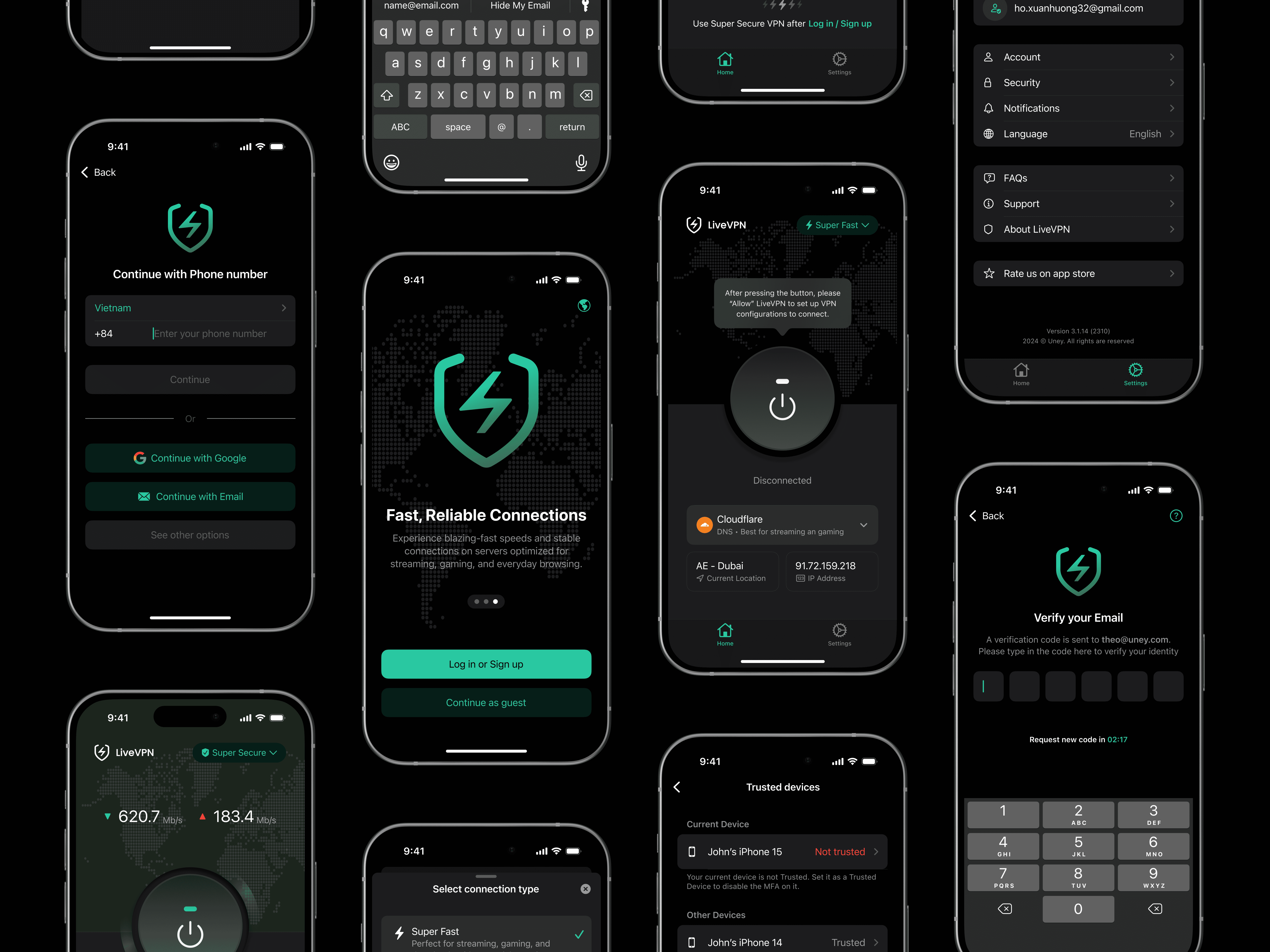
Simplifying Security for Every User
LiveVPN is a security-focused mobile app that empowers users to seamlessly switch between high-speed DNS mode and highly secure VPN mode. Built to prioritize privacy without compromising performance, the app offers an advanced yet approachable experience. As the senior product designer, I led the UX, UI, and motion design strategy end to end.
| Role: Senior Product Designer (Mentoring 1 designer)
| Timeline: 2 months
| Platform: iOS & Android
| Tools: Figma, FigJam, Lottie Files and JIRA
| Team: 1 PM, 2 Developers, 2 QA, 2 Designers (Incl. me)

Design Goals
Our main objective was to make security accessible without diluting its technical depth. Starting from two base systems — Material Design and Apple HIG — I customized and unified the visual language to suit each platform while preserving brand consistency.
Beyond interface design, the focus was on empowering users with clear controls, smooth transitions, and microinteractions that subtly communicate trust and responsiveness. Fast alignment with stakeholders helped maintain momentum and decision clarity throughout.


Screen Highlights
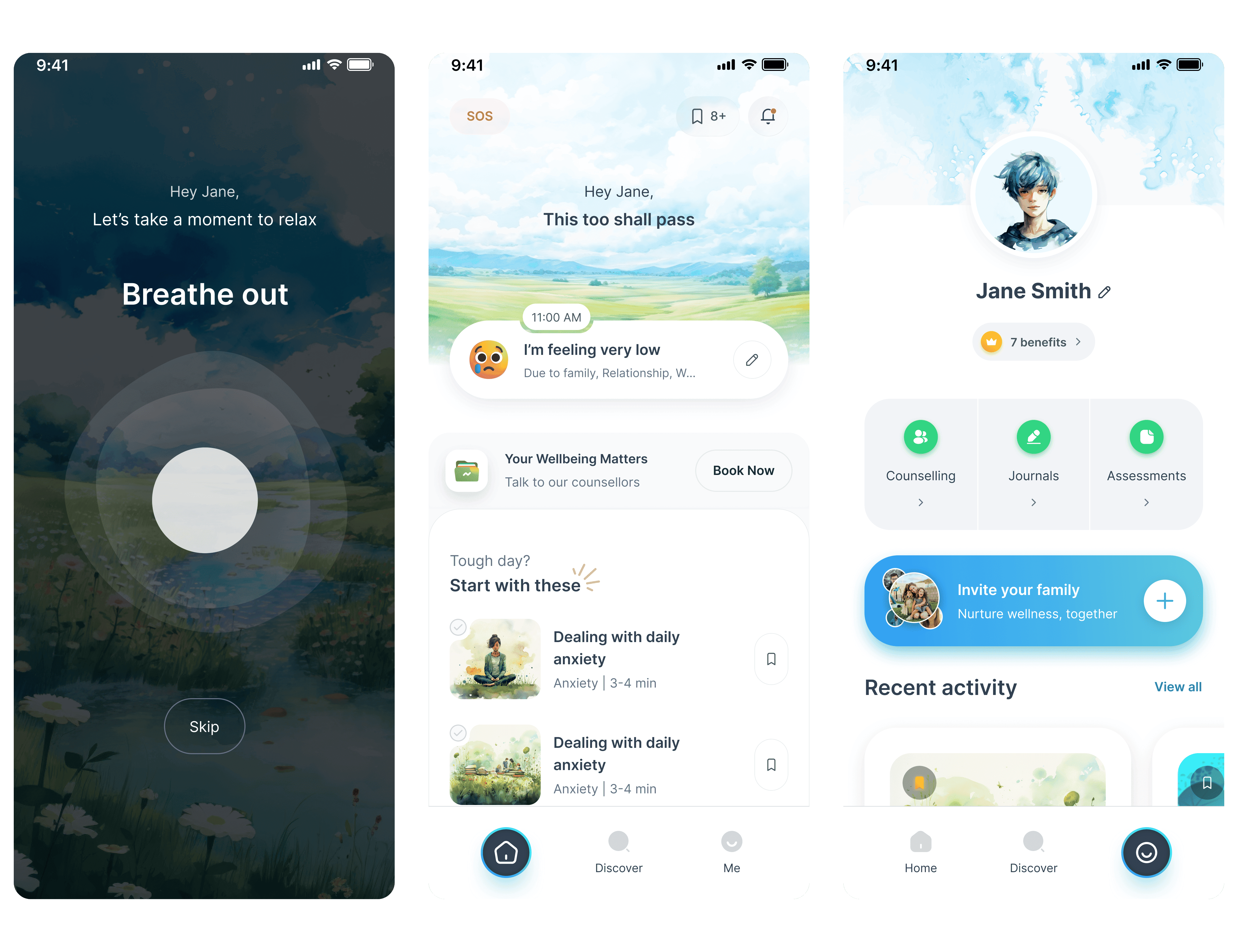
A) Onboarding & Access
Designed to minimize friction and build immediate trust. Each step is reduced to essentials, guiding users from download to secure connection in under 30 seconds. The emphasis is on speed, clarity, and setting the tone for an effortless privacy-first experience.


B) Homepage & Connection Status
Acts as a real-time status center. Focused on presenting critical connection info clearly — active state, location, and speed — without visual noise. Prioritized quick tap-to-connect interactions and strong visual signals to reassure users at a glance.

C) VPN & DNS Mode Switch
Core differentiator of the product. Built to encourage confident switching between secure VPN mode and high-speed DNS mode. The interaction design focuses on immediacy and feedback, using fluid motion and strong toggle states to reinforce the sense of control.

D) Settings & Preferences
Streamlined to avoid overwhelm. Split into logically grouped sections so users can customize without getting lost. Visual consistency and subtle motion cues make adjustments feel simple, supporting a calm, high-trust brand personality.

Impacts & Takeaways
Key results and lessons that shaped the final product:
Delivered robust, dual-platform design systems and fully tested flows in just two months
Built strong cross-functional trust by working directly with stakeholders and developers in rapid iterations
Mentored a junior designer, strengthening team skill-sharing and overall design depth
Validated that even deeply technical security features can feel seamless when design and engineering are fully aligned from the start
Explore Other Works


More about me