A workplace-focused mental wellness app designed to promote healthier teams and happier minds.
UX Design
Design System
UI Design
Micro-Interactions
Fostering Emotional Wellness at Work
Tranquil is a workplace-focused mental wellness app designed to help employees build healthier habits, reflect on their emotions, and feel supported in their daily work life. As the product designer, I led UX, UI, and visual system development, ensuring each interaction felt warm, approachable, and non-intrusive.
| Role: Design Guide
| Timeline: 6 months
| Platform: iOS, Android & Responsive Web
| Tools: Figma, FigJam, Lottie files and ClickUp
| Team: 1 PM, 6 Developers, 2 QA, 3 Designers (Inc. me)

Design Goals
The goal was to create a mental wellness experience that felt truly safe and inviting for employees — not clinical or intimidating. My approach focused on soft visual language, supportive microinteractions, and carefully balanced content that encourages daily engagement without pressure.
We prioritized emotional accessibility through subtle animations, gentle prompts, and a clear sense of progress. Direct user feedback sessions guided refinements to ensure the app felt personal and trustworthy throughout.

Screen Highlights
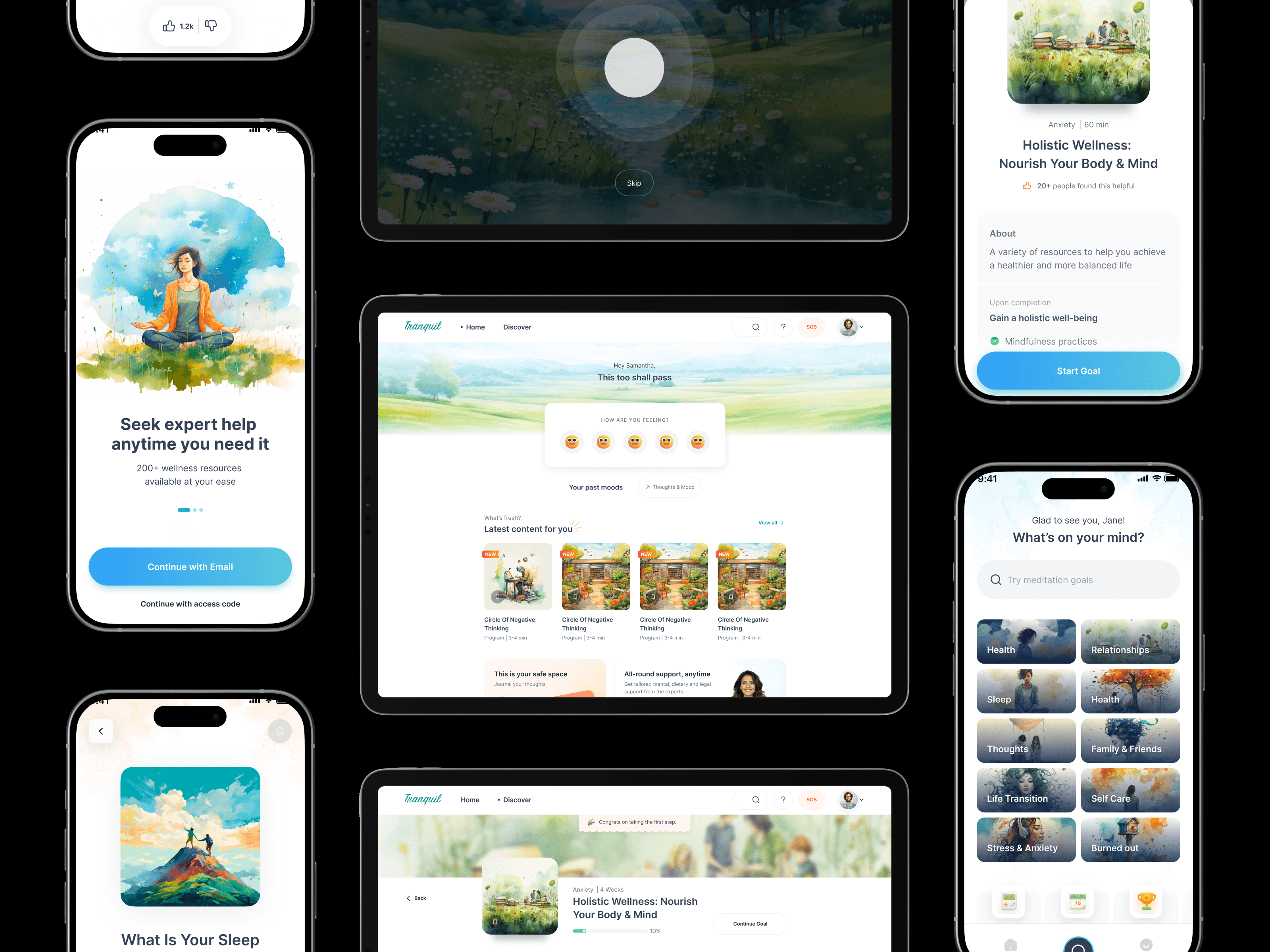
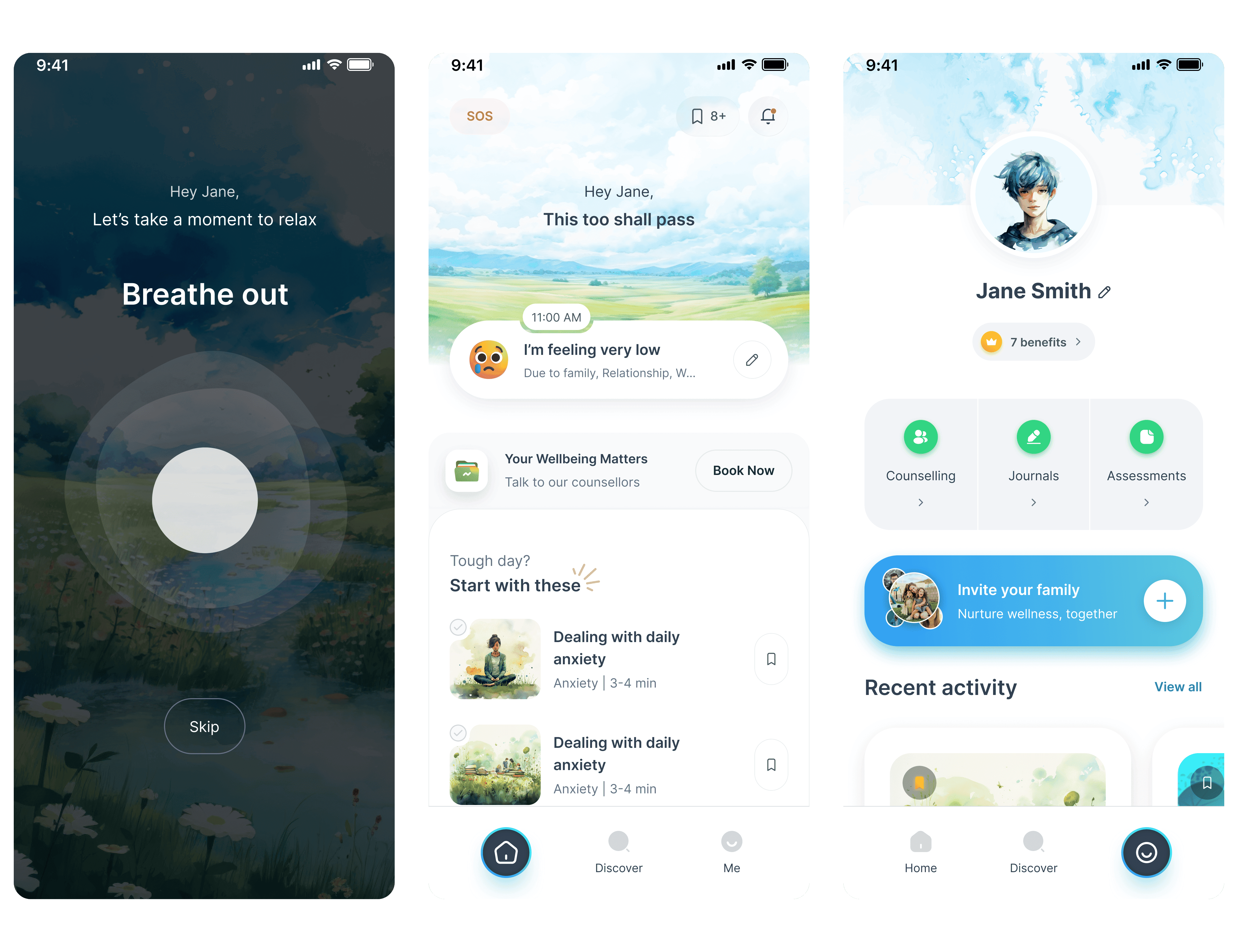
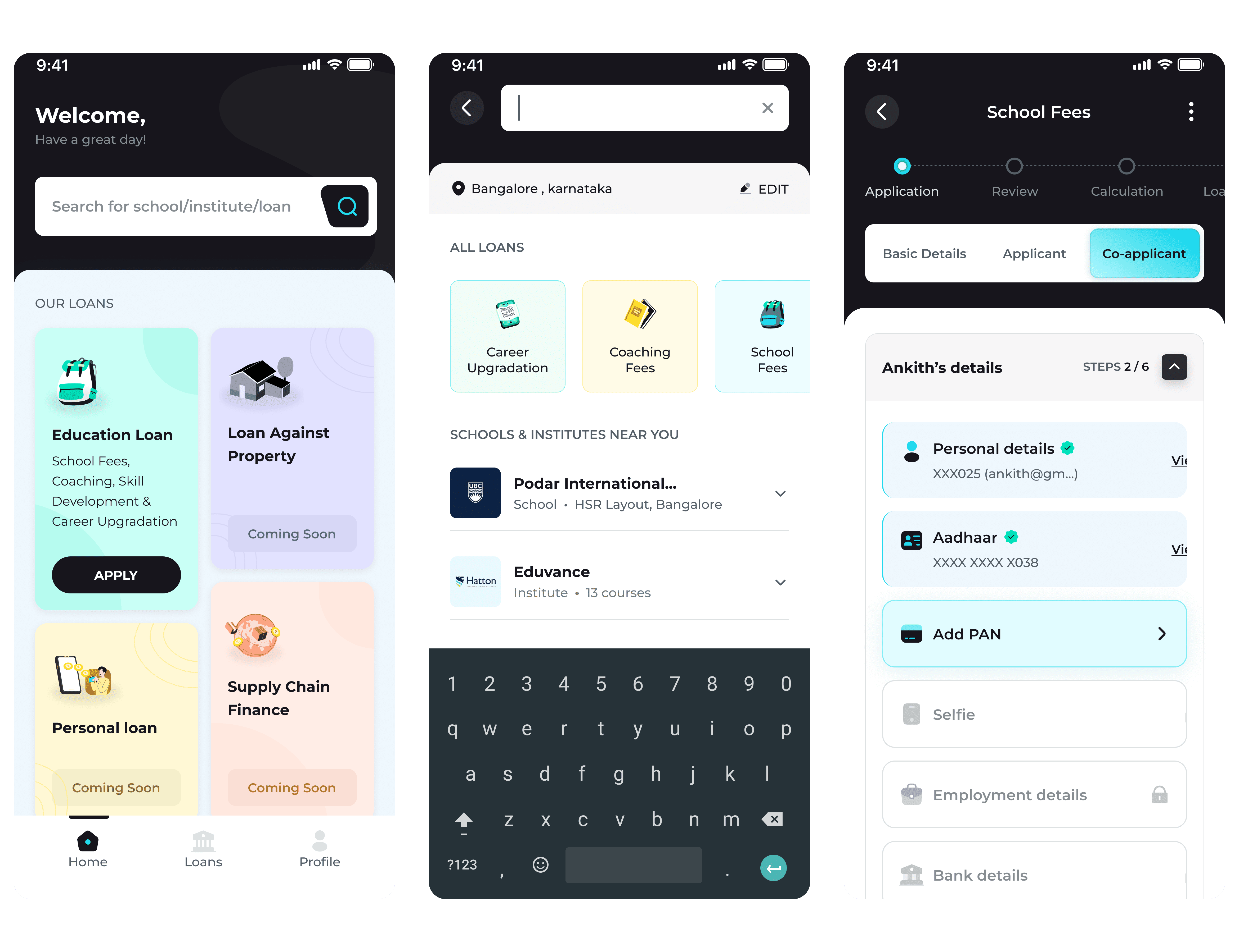
A) Employee Onboarding
Guided setup tailored to each user’s mental state and organizational context. Focused on simplicity and personalized tone to build trust from day one.


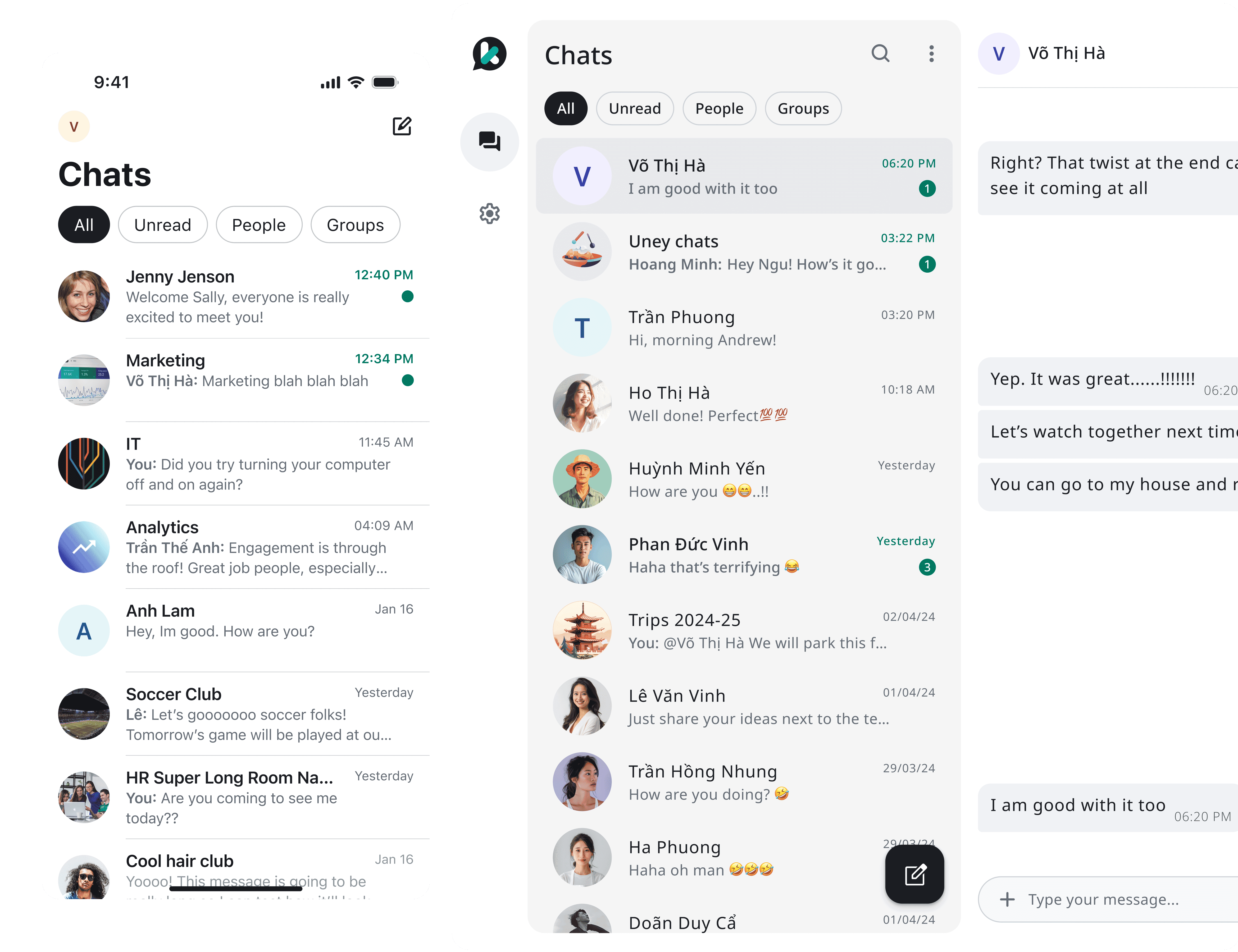
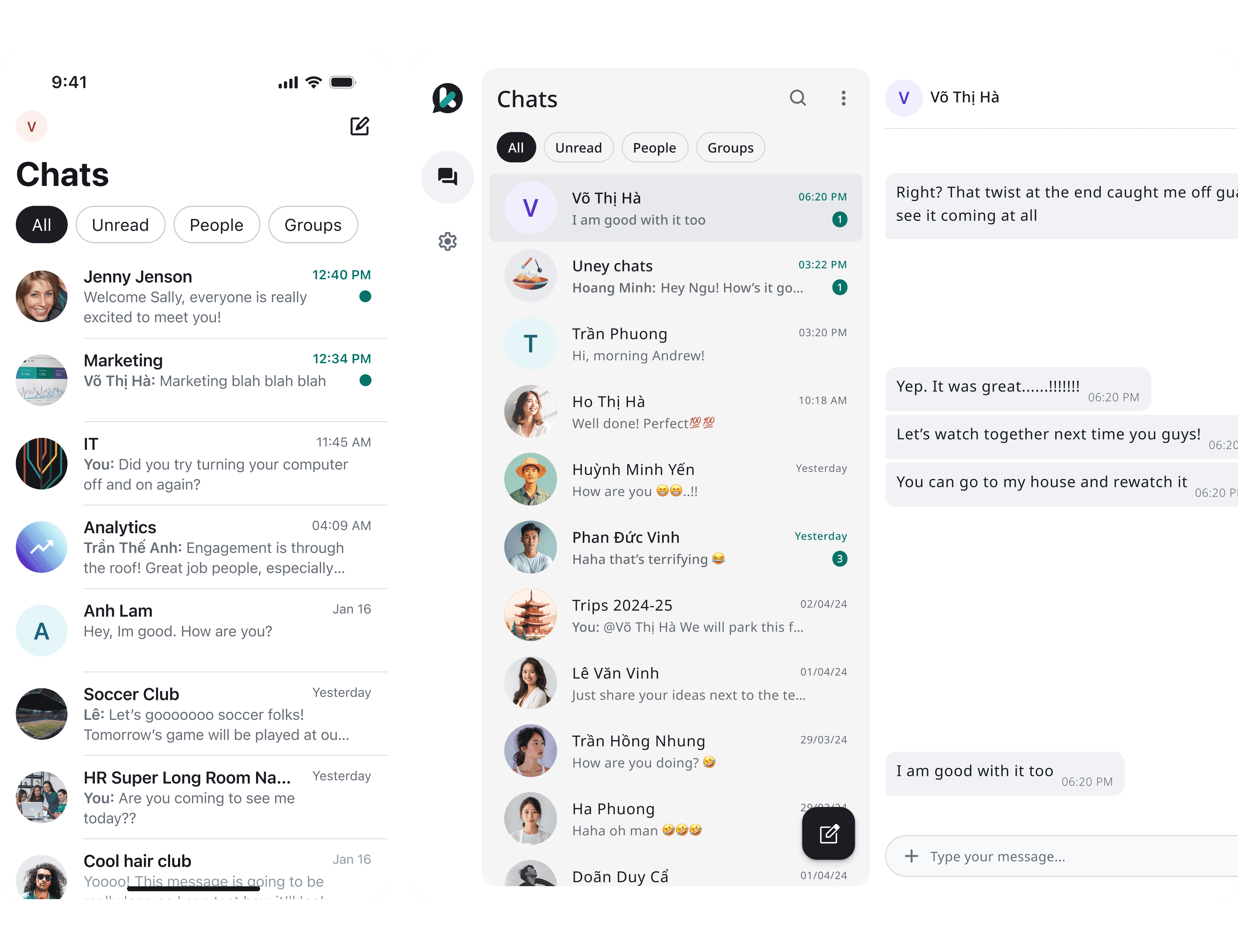
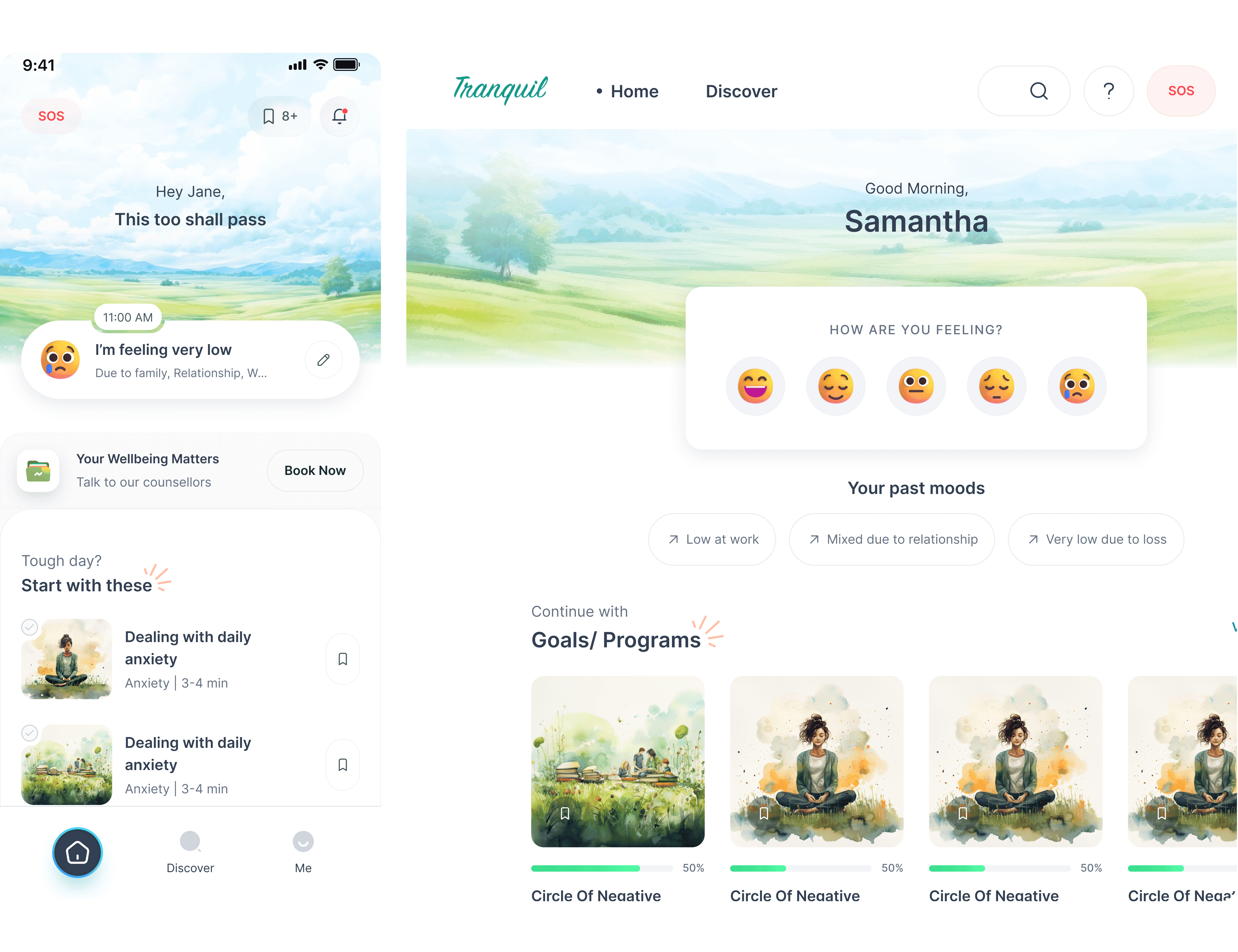
B) Homepage & Mood Check‑in
Central hub featuring a friendly mood journal and daily prompt. Designed to encourage reflection and maintain engagement through subtle nudges and supportive tone.


C) Explore & Discover
Offers curated offerings — mindfulness tracks, CBT tools, and counselling. Structured for easy discovery, with clear labels and bite-size previews to reduce overwhelm and guide choices.


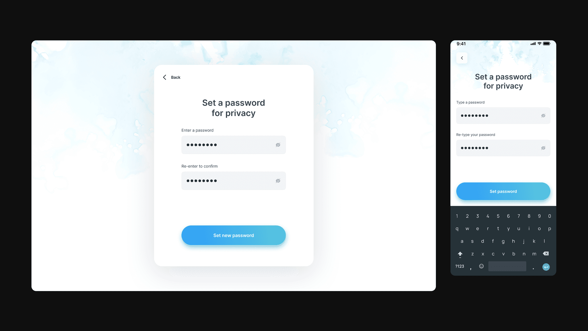
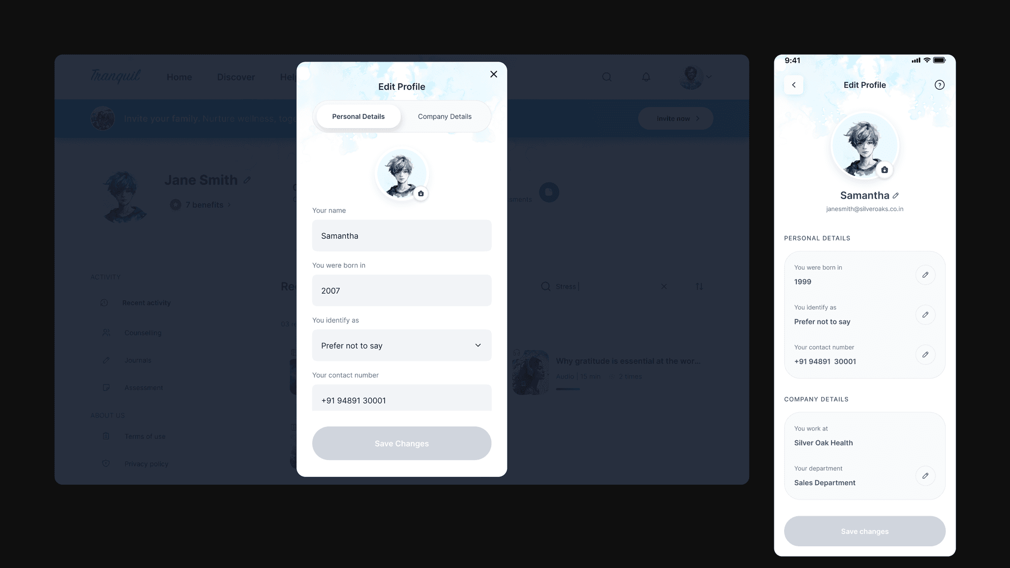
D) Settings & Personalization
Allows users to tailor their experience — notification frequency, theme, and privacy controls. Designed for autonomy and emotional safety, reinforcing a sense of personal agency.


Impacts & Takeaways
Key results and lessons that shaped the final product:
Enabled smoother and interactive daily check-ins and higher emotional engagement through intuitive, non-demanding flows
Increased user trust and participation rates by grounding every screen in warmth and clarity rather than overwhelming metrics
Reinforced the importance of emotional design when addressing mental wellness, validating that subtlety often drives deeper connection
Strengthened the belief that supporting mental health in the workplace requires thoughtful design choices at every level — from colors to microinteractions
Explore Other Works


More about me